Saturday, August 27, 2011

DIY @mention constellations, Part IV

So far there's been

and now we're going to take a look at applying Graphviz to large Twitter mention graphs.

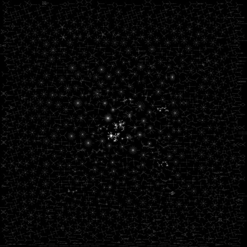
Getting the data is easy enough: see the embedded 39-line Python script in the sample code. So let's say you run that Python code to give you 50,000 random mentions from the Twitter firehose. Let's say that having done that, having sort'd and uniq'd, and added a one-line header and one-line footer you have, like I do, a 47,375-line file which begins with

digraph mentions {
"0001am_" -> "kaaly_"
"000eca000" -> "000eca000"
"000eca000" -> "kira_moka"
"000parra" -> "amolosflips_"
"00_dag" -> "nishinoakihiro"
"00alliesmeaton" -> "caitlanpratt"
"00kuro" -> "sena1029"
"00nelht" -> "gvwriters"
"00rico00" -> "tsubo0307"
and ends with
"zwackleby" -> "gauravh1"
"zxicee" -> "parnnnparnnn"
"zyhafiyah" -> "amyshaheera"
"zyhnlyh" -> "elsaaps"
"zymecca" -> "wowkonyol"
"zz0_ee" -> "becky_aisha"
"zzangfia" -> "somin_somu"
"zzz_ho" -> "dewwanna"
"zzzoob" -> "ko5712"
}
that is, you have a directed graph in DOT format representing unique mentions amongst a random sample of 50,000 from Twitter.

Having seen how simple Graphviz is, you'll probably render a graph directly from this file, with a command like

sfdp -Gbgcolor=black -Ncolor=white -Ecolor=white -Nwidth=0.02 \
    -Nheight=0.02 -Nfixedsize=true -Nlabel='' -Earrowsize=0.4 \
    -Gsize=75 -Gratio=fill -Tpng mentions.gv > mentions.png
from which you'd get this image, after waiting a long long time (on my machine about four hours):
Full Mention Graph

Most likely you'd be agog, like I was when I ran this process for the first time. And then, like I did, you'd wonder how to make it faster and how to get rid of the fairly dull stuff round the edge. You might also wonder, like I did, what's inside that blob in the center.

That's for next time.

Next: Part V

Sunday, August 21, 2011

DIY @mention constellations, Part III

So you checked out Part I and Part II, no doubt. You probably installed Graphviz, maybe you tried out the shell script I posted on pastebin, and perhaps you have your own one of these now:

Basic Mention Graph

If so, nice going. This post is going to dial it wayyy back and start at the beginning working with some basic Graphviz functionality.

Graphviz is a suite of software tools for working with graph data, where you can think of a graph as a set of nodes, some of which are connected by edges. At its most basic a graph is a bag of dots with a bunch of lines connecting some dots to other dots. As you'll see, there's more than one way of representing this visually

But talking of dots, Graphviz works with data assembled into a format known itself as DOT. Here's an example of a graph defined in the DOT language:

digraph basic {
    x -> y
    y -> x
    y -> z
    z -> a
    z -> a
    a -> x
}
It defines a graph where the nodes are identified by the letters x, y, z and a.

Save the above graph definition as a text file called basic.gv (Graphviz documents have extension .gv by convention); we're going to use the basic Graphviz commands to visualize this graph in different ways.

At the command line, run this:

dot basic.gv -Tpng > basic-dot.png
and here's what you'll get as output:
Basic dot
Simple! This represents our graph perfectly. Try this:
neato basic.gv -Tpng > basic-neato.png
to get
Basic neato
And then there's twopi and circo:
twopi basic.gv -Tpng > basic-twopi.png
gives
Basic twopi
and
circo basic.gv -Tpng > basic-circo.png
results in
Basic circo

Finally, we're going to add some styling options to the graph. Run this command:

circo basic.gv -Gbgcolor=black -Ecolor=yellow -Earrowsize=0.3 -Epenwidth=0.4 -Nlabel='' -Nwidth=0 -Nheight=0 -Nfixedsize=true -Gsize=4 -Gratio=fill -Tpng > basic-circo-options.png
to get the output
Basic circo options
You can see how this works. The -G options apply to the whole Graph. The -N options to the Nodes and the -E options to the Edges. There's online documentation covering all the various options.

Now imagine that rather than basic.gv

digraph basic {
    x -> y
    y -> x
    y -> z
    z -> a
    z -> a
    a -> x
}
we have instead a graph representing Twitter users @mentioning each other. In the next post we'll look at how we could apply Graphviz to that.

In the meantime, here's where you can ultimately take this. A 369 megapixel graph of the largest connected component amongst 30m mentions on Twitter, with the most active 80k users removed. I'm working on identifying the clumps; I suspect that they're geographic or language regions.

Next: Part IV

Thursday, August 18, 2011

DIY @mention constellations, Part II

At work I wrote a document entitled "Pig for Dilettantes and Cargo-Culters". If you're the kind of person who's at least once used Terminal.app on the Mac, but know little about distributed computing or Twitter's big data schemata, then following the steps in that document is probably the fastest way to get to the point of being able to extract meaningful data out of the Twitter Hadoop cluster. From there you can explore, tweak the scripts, and eventually you'll be able to get the data that you're actually interested in.

In a similar vein I present this post. If you've never opened Terminal.app on the Mac then this probably isn't for you. If you know basically what's going on at the command line, and you're a hardy explorer/experimenter, then read on.

First of all, I presume you've read Part I and have installed Graphviz. Both are required, I'm afraid. Not strictly required is a Mac, but if you're running something other than OS X then you're likely going to need to make some small adaptations for your platform.

So, with Graphviz installed, check out the mention-graph shell script I put on pastebin. Copy it, save it to your Mac as mention-graph, chmod +x it, and you're set.

Using this script, I just ran a constellation of 50,000 live mentions from the Twitter Streaming API, 75 inches square (72 dpi), by running "./mention-graph -n 50000 -u isaach -o -v -s 75":

Screen shot 2011 08 18 at 11 26 16 PM
and here's the output it dropped as mention-graph.png:
Basic Mention Graph

You need to supply your Twitter credentials (the above command, which you should edit to use your own username, will ask for your password) and note that this script sends them in the clear to Twitter. If this worries you then feel free to either edit the script to meet your security standards, or create a Twitter account dedicated to this kind of use, separate from your primary account.

Next time: what this all means and how to take it further. In the meantime, let me know on Twitter how you get on.

Next: Part III

DIY @mention constellations, Part I

People really enjoyed the mention constellation thing. I'm chuffed that on Twitter I've received Tweets about it from five continents, and the thing's been written about by friends and strangers alike. People at work liked it too, which means a lot to me.

A couple of questions I got stood out: (a) can I get the data?; and (b) can I get the code?

The answer to both is yes!

I'm going to do two things. First of all I'm going to post a complete, free, end-to-end solution for generating something like this:

Basic Mention Graph
Secondly, I'm going to explain how the code works.

First of all, though, you need to install Graphviz. It's straightforward, especially on a Mac. Go!

Next: Part II

Sunday, August 07, 2011

About the @mention constellations

Update: find out how to make one of these.

So, about this @mention constellations stuff.

The FAQ:

  • What exactly am I looking at? The main visualization is a map of Twitter mentions on June 21st. Each dot is a Twitter account. Each arrow dot-to-dot illustrates one account mentioning another. Despite the scale of the diagram the underlying dataset is relatively tiny: less than 10 minutes of conversation.
  • Why do some accounts seem to mention themselves? Occasionally accounts do actually mention themselves.
  • Can I get the data? Behind this visualization of June 21st in particular? No. In order to make the same thing from another day? Sure, you can get more than enough data to produce these things for free from the Twitter Streaming API.
  • What's the blob in the middle? Technically speaking it's the largest connected component of the mention graph. I just uploaded a detailed look inside it.
  • What software did you use to make this? Mainly Graphviz.
  • Sure, but how exactly did you make it? I took a sample of Tweets from Twitter's internal Hadoop cluster. I used a tiny Python script to extract the mentions. I loaded the data into a local MySQL instance. I queried MySQL for a sample of the mentions. I formatted the sample into dot using Perl and I laid out and rendered a PNG using Graphviz.
  • Is this your job at Twitter? No, this is a hobby project.
  • What's it like to work at Twitter? Very cool indeed. If you're interested I wrote some stuff about my transition from Google to Twitter at http://isaa.ch/workthoughts.

Tuesday, August 02, 2011

More @mention constellations

The previous post showed a glimpse of a work in progress. Today marks the first formal checkpoint of my hobby project and I'm proud to present the first full iteration at http://isaa.ch/mentions.

What you're looking at is a visualization of a sample of Twitter @mentions on one day in late June. Each vertex is a Twitter account. Each directed edge is a mention of one Twitter account by another. You can see some accounts which get mentioned a lot (lots of inbound arrows to a central point) and accounts which do a lot of mentioning (lots of outbound arrows from a central point; these are mainly automata).

I find it absolutely captivating to explore. It's like a safari of conversational molecules.

Coming soon: more details about how I generated this visualization, and how you can produce your own.